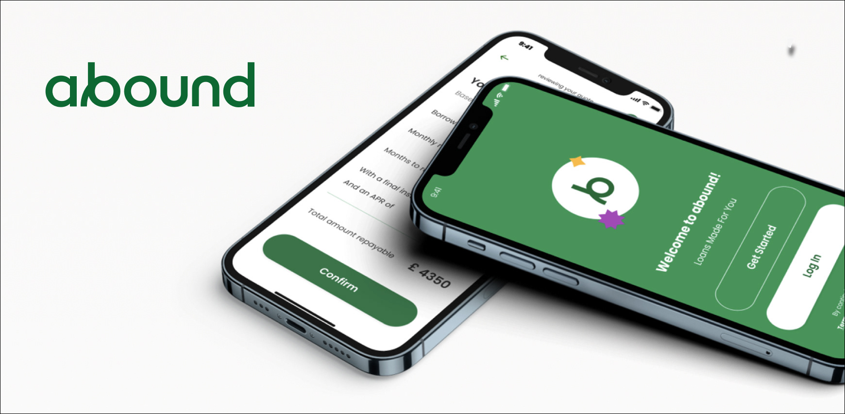
Abound is the new way of getting a loan: fast, flexible, and personalized.
Their mission is to increase access to affordable loans.
My role within this project was to find a way to make the user trust the service and use it efficiently while the business side benefits from it.
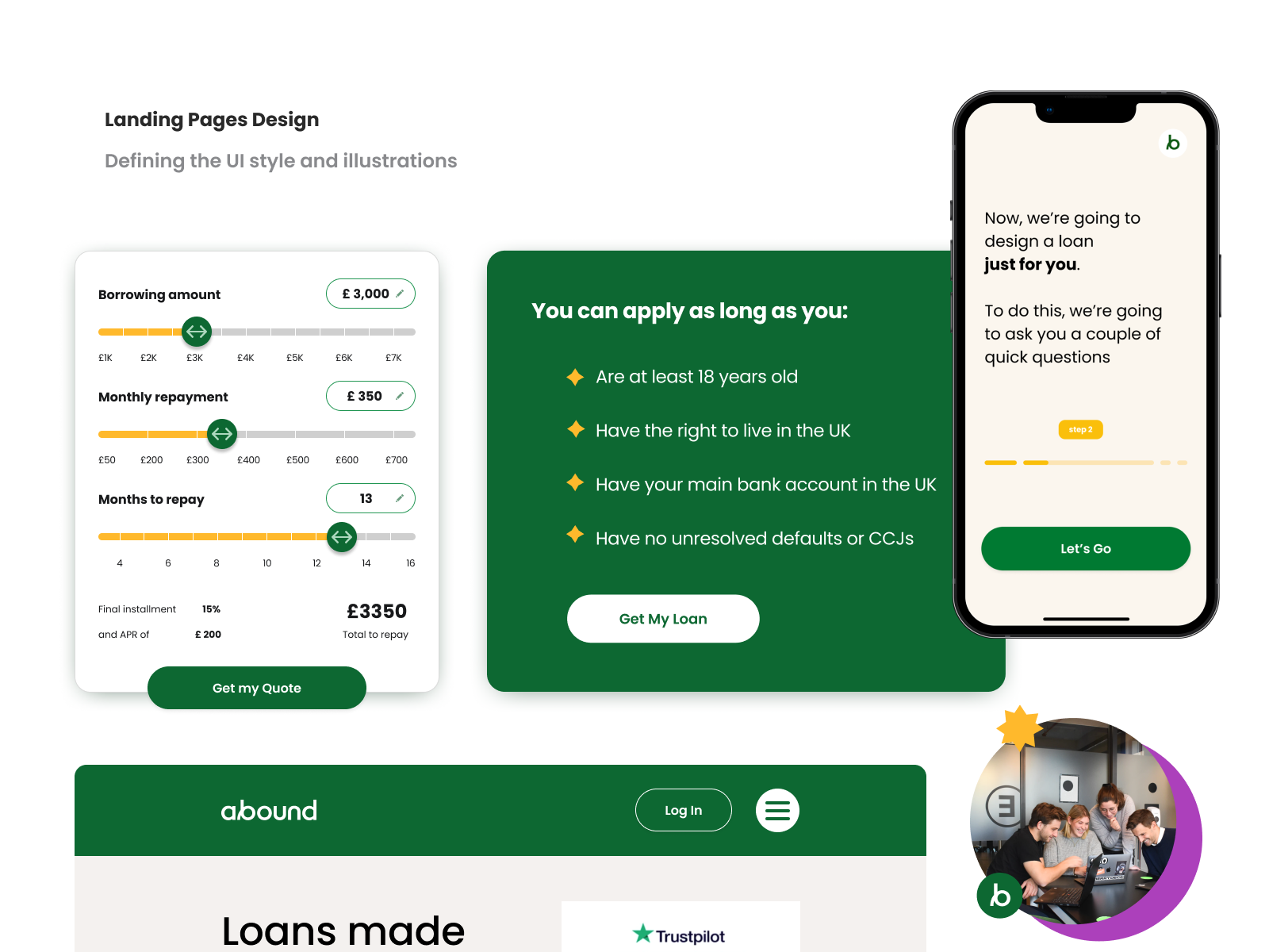
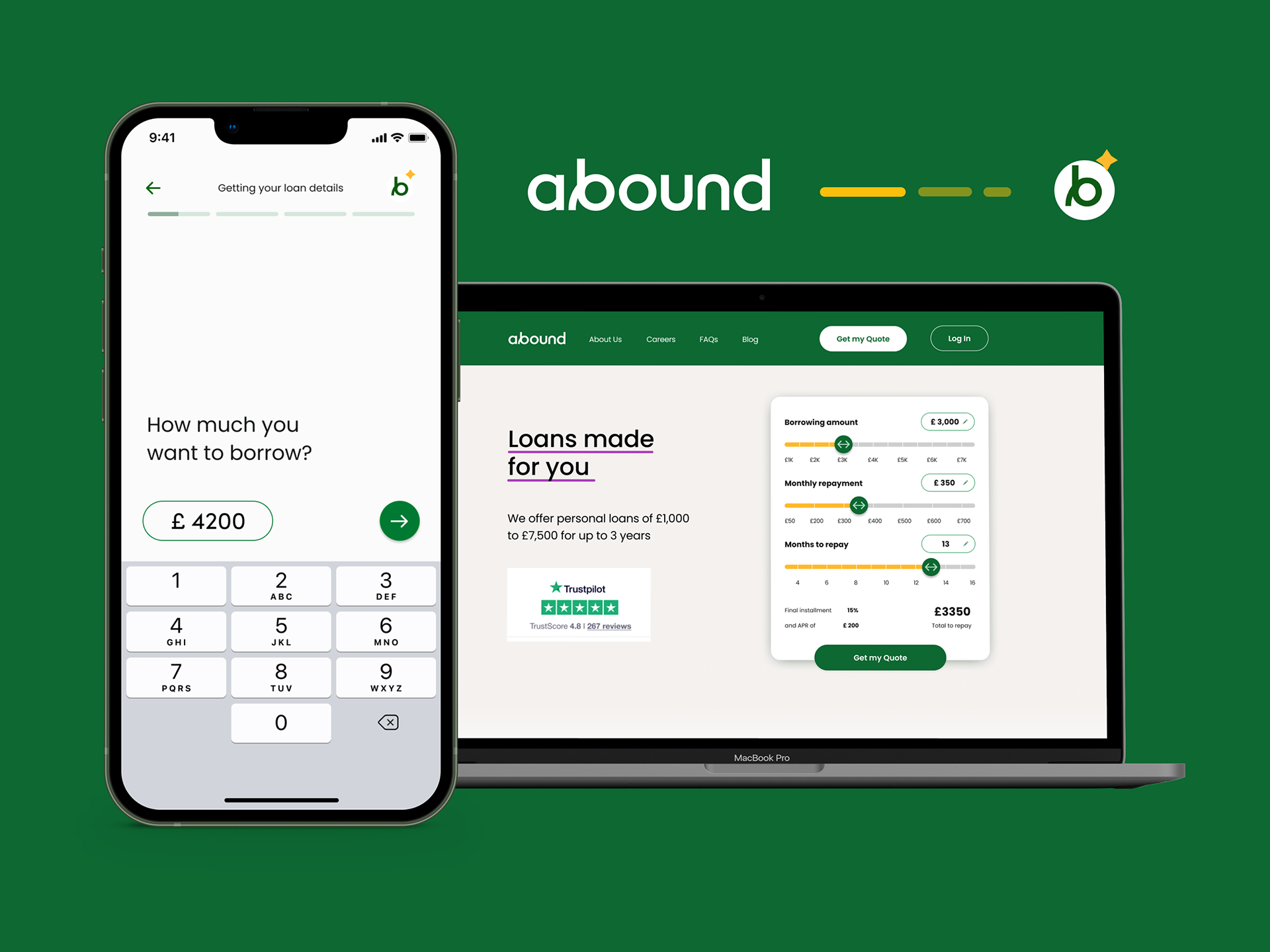
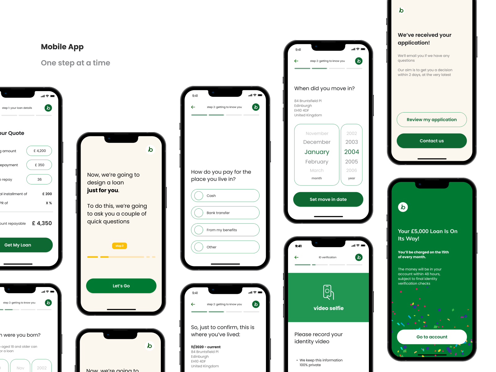
By working on the web app redesign, I followed the rule 'one step at a time,' which made the flow much longer technically, but it felt smooth.
The challenges also appeared, of course, and we successfully solved them with the client's fantastic team. Learn more about the product by visiting 🔗 getabound.com
Their mission is to increase access to affordable loans.
My role within this project was to find a way to make the user trust the service and use it efficiently while the business side benefits from it.
By working on the web app redesign, I followed the rule 'one step at a time,' which made the flow much longer technically, but it felt smooth.
The challenges also appeared, of course, and we successfully solved them with the client's fantastic team. Learn more about the product by visiting 🔗 getabound.com
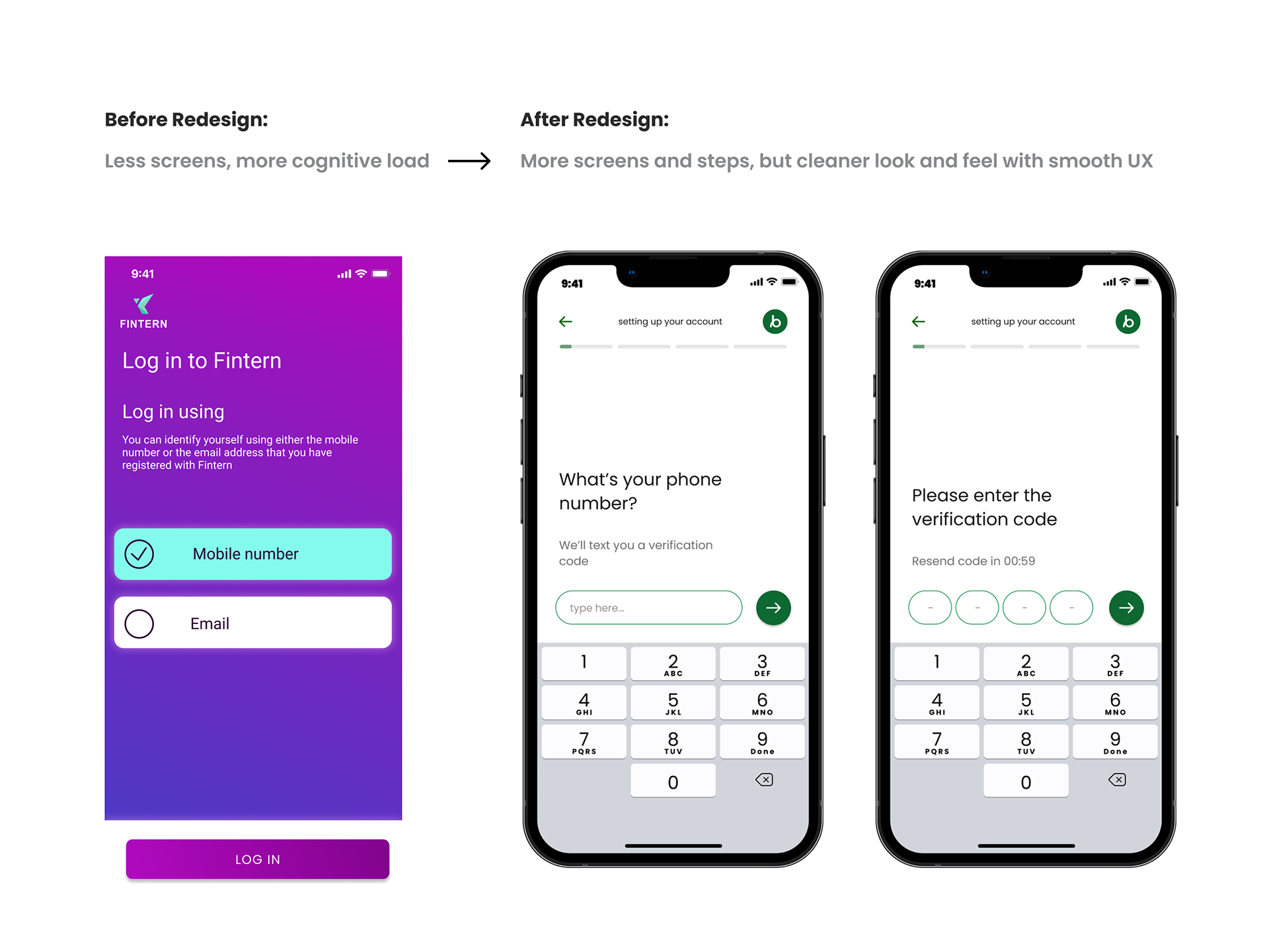
The design before and after.
It's a lot to ask from the user who wants to get a loan. Sensitive information complex scenarios apply. So, visual language uses only when needed.
Getting confirmation to get a loan might take a few days, and the process is divided into a few stages. We ensured the users understood where they were in this journey, and the app communicated back to inform them about the status.
As a result, the user journey became longer, but the clearness of each step gives a feeling of a smooth process. Which, in the end, goes faster.
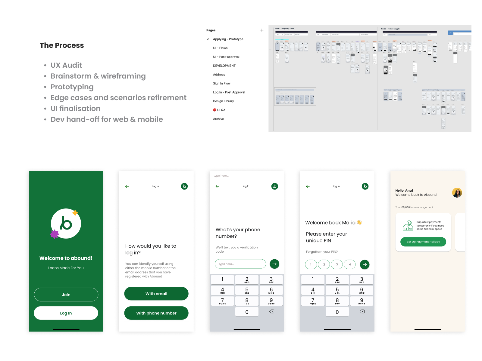
How it's been done.
Of course, everything started with research.
Countless messages, dozens of Figma pages, zoom calls, and brainstorming sessions result from excellent teamwork lead to the result.
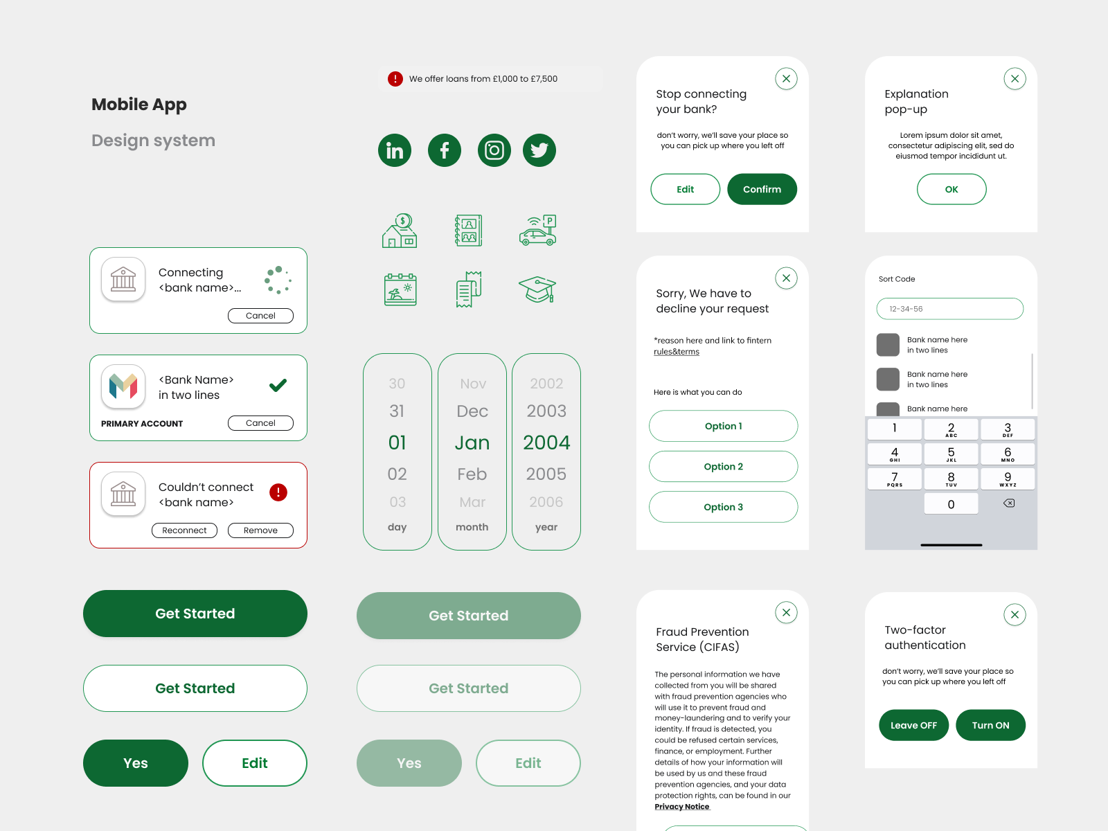
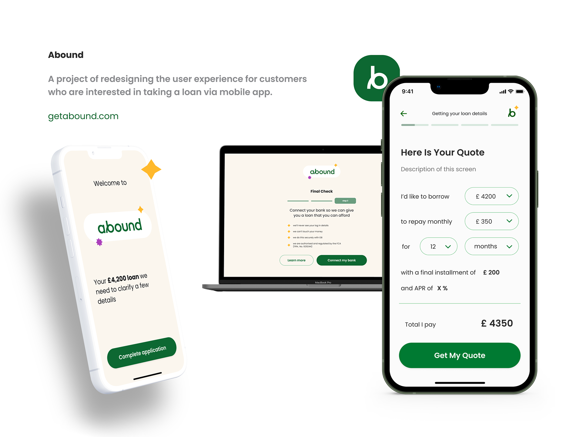
I was also asked to design a landing page, an app icon, a web version of an app, and lots of small marketing materials, which is, of course, a part of a good branding setup.