Logotype
Mexticket is a Mexican travel service that offers its customers the full range of travel experience from the plane ticket to the event entry. It differs from other brands a lot: with a friendly attitude, personalization, excellent service. Moreover, this company offers its customers all-in-one packages in different price ranges.
So our part of the work here was to create a celebrating, new, and cheerful visual language, which gives people this exciting feeling of traveling abroad very soon without any headache.
The project was finished at the end of 2019.
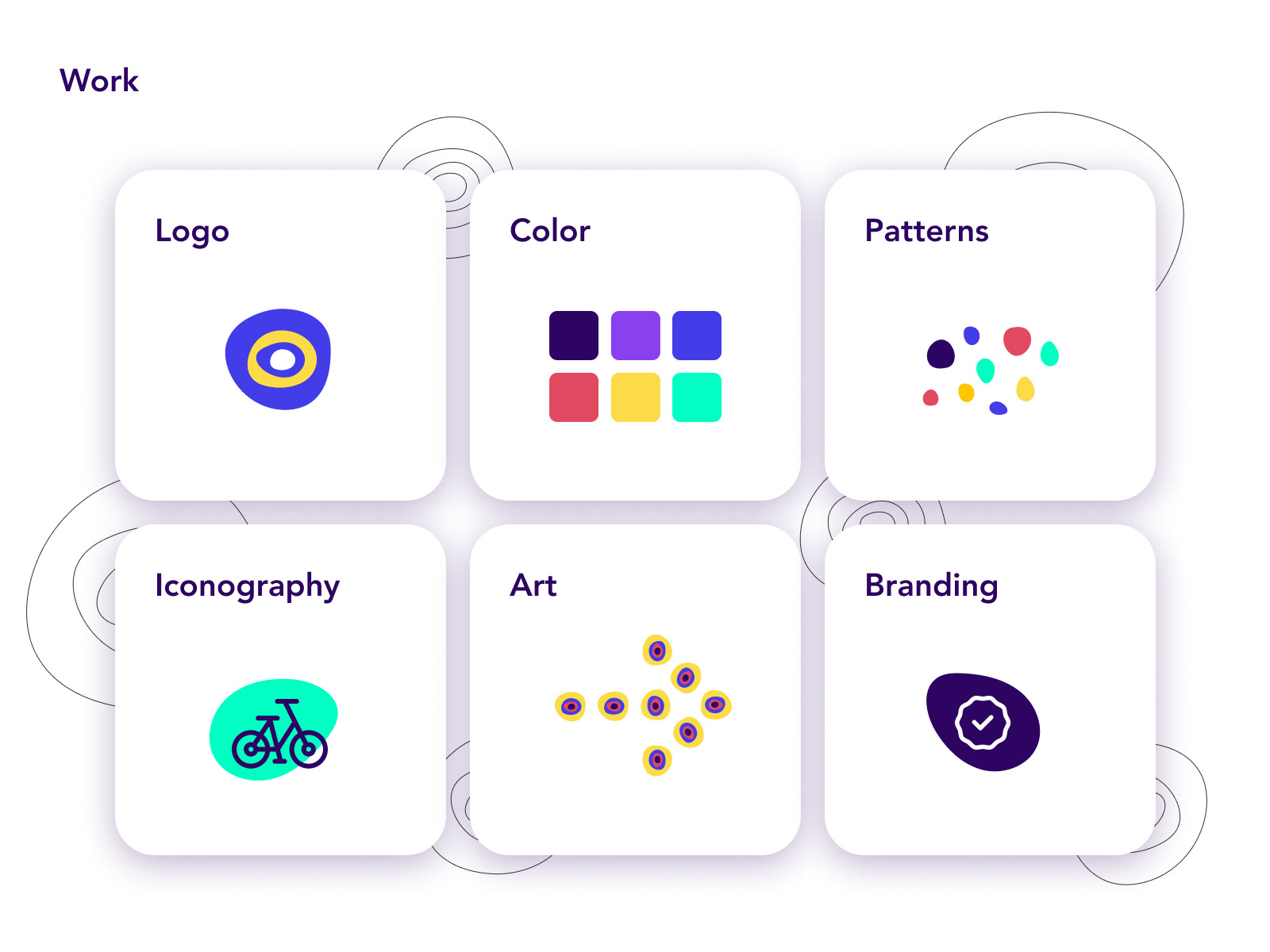
Scope of work
Workin on the brand means to imagine and embrace the whole galaxy of visual language. In the case with Mexticket, we started with a few Q&A sessions about the customers, logistic process, advertising methods, and the stakeholders' goal. Based on the given info, my analysis presented the main points of focus and its sequence: logo, color palette, different patter creation, iconography and illustration or art, and only then - the full branding elements based on the current needs of client.
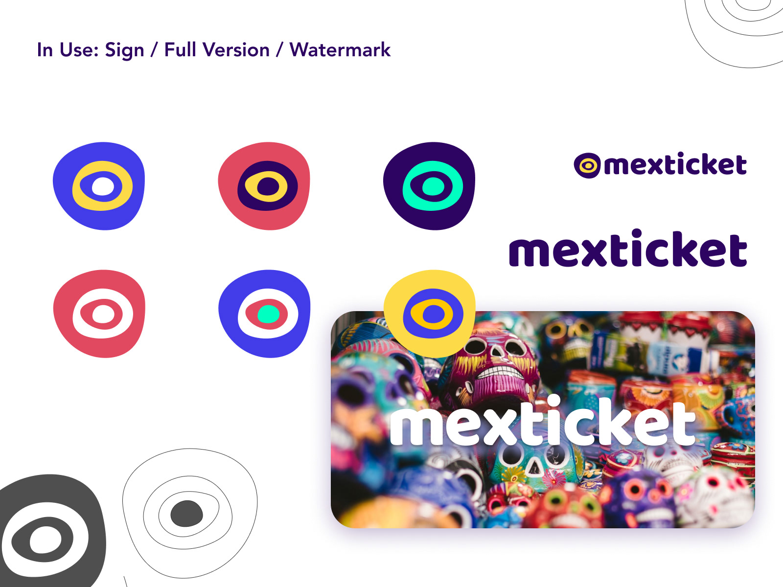
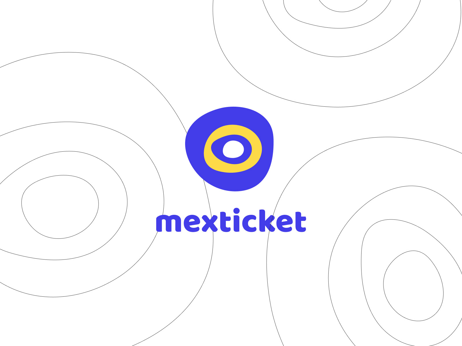
Logo visualisation
Mexticket's logo is very dynamic. Depend on the use case, it could be colored differently (from the palette only, of course), be a part of the image, stand alone as a watermark or a full sign+word composition.

Pattern
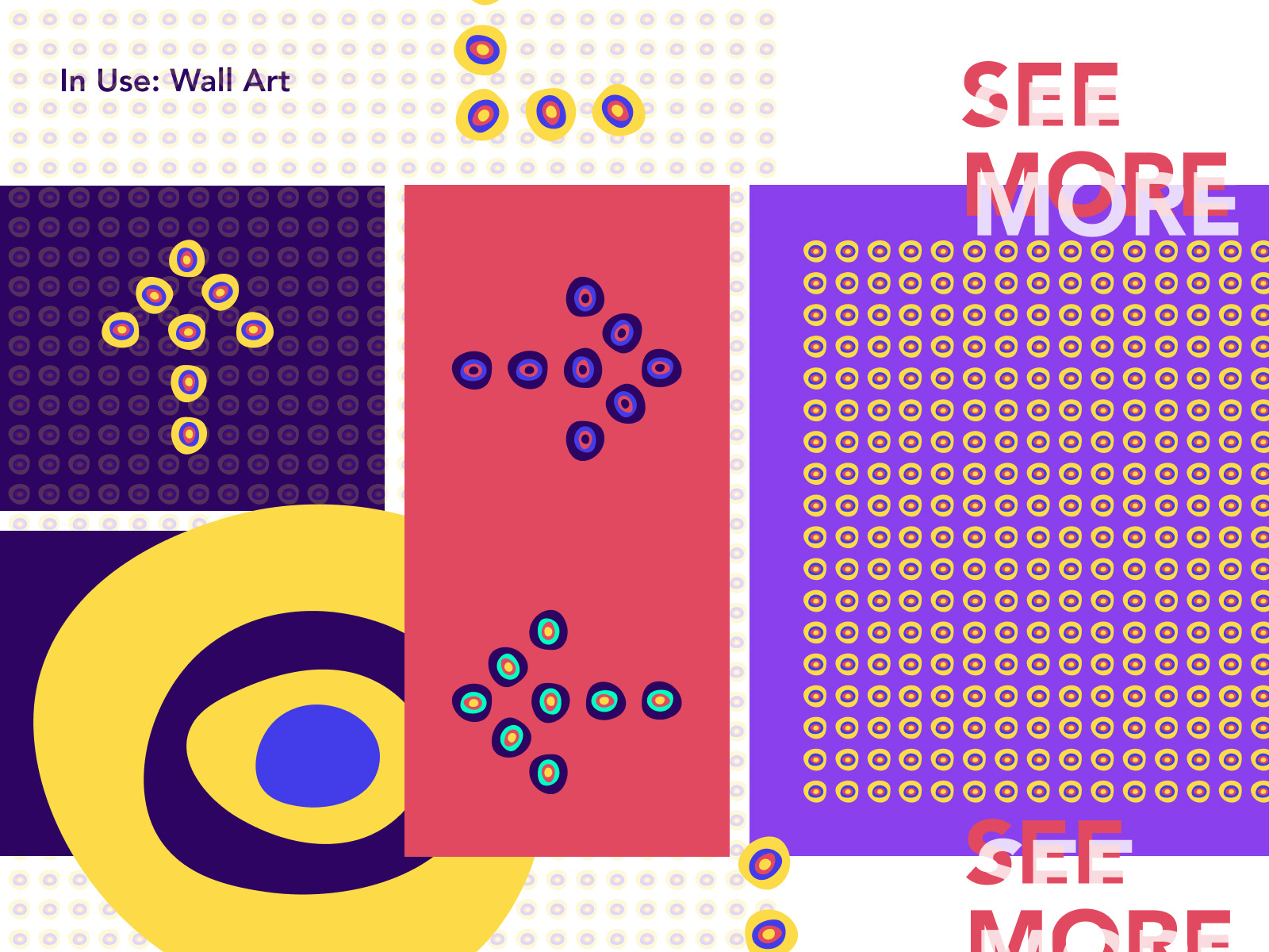
The Brand is not just a logo, it's an emotion that people experience. The brand has to trigger, maintain, and evoke again these amazing feelings in people's hearts. So, the strongest techniques in this project are the contrast, colors, vibrance and abstract rounded shapes (which are the most friendly ones for the human eye).
Art
Being a brand within an entertainment industry requires a lot of attention-grabbing and focusing on emotions. I've prepared a few groups of patterns that could be used in different sizes and print techniques.
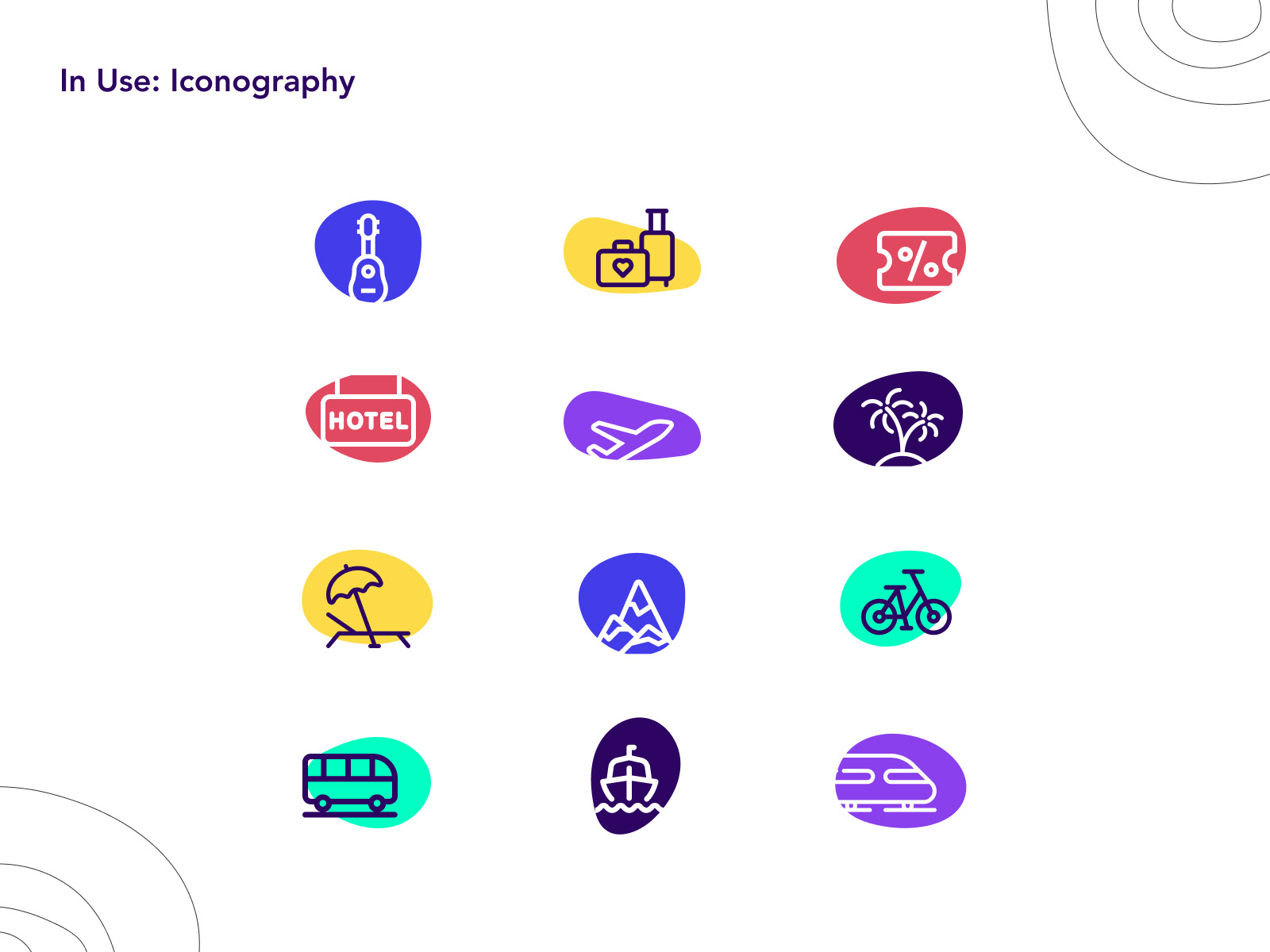
Iconography
Visual language for online and offline navigation. The main principles here are legibility, easy-to-find, color indication.
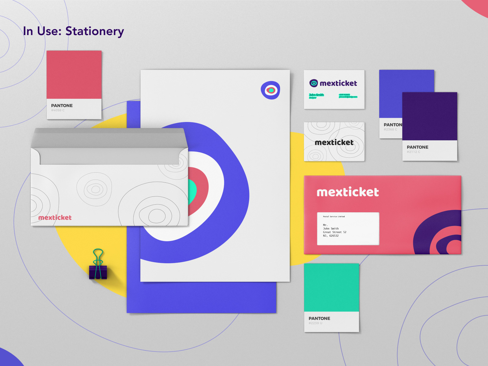
Stationery
Like any other brand, especially the travel company, Mexticket needed a vibrant, fresh, and exciting branded elements. I went with the logo and color interpretations spread all over the envelopes: to make boring letters and paperwork as more cheerful as possible. Travelling is fun, so why hiding it?
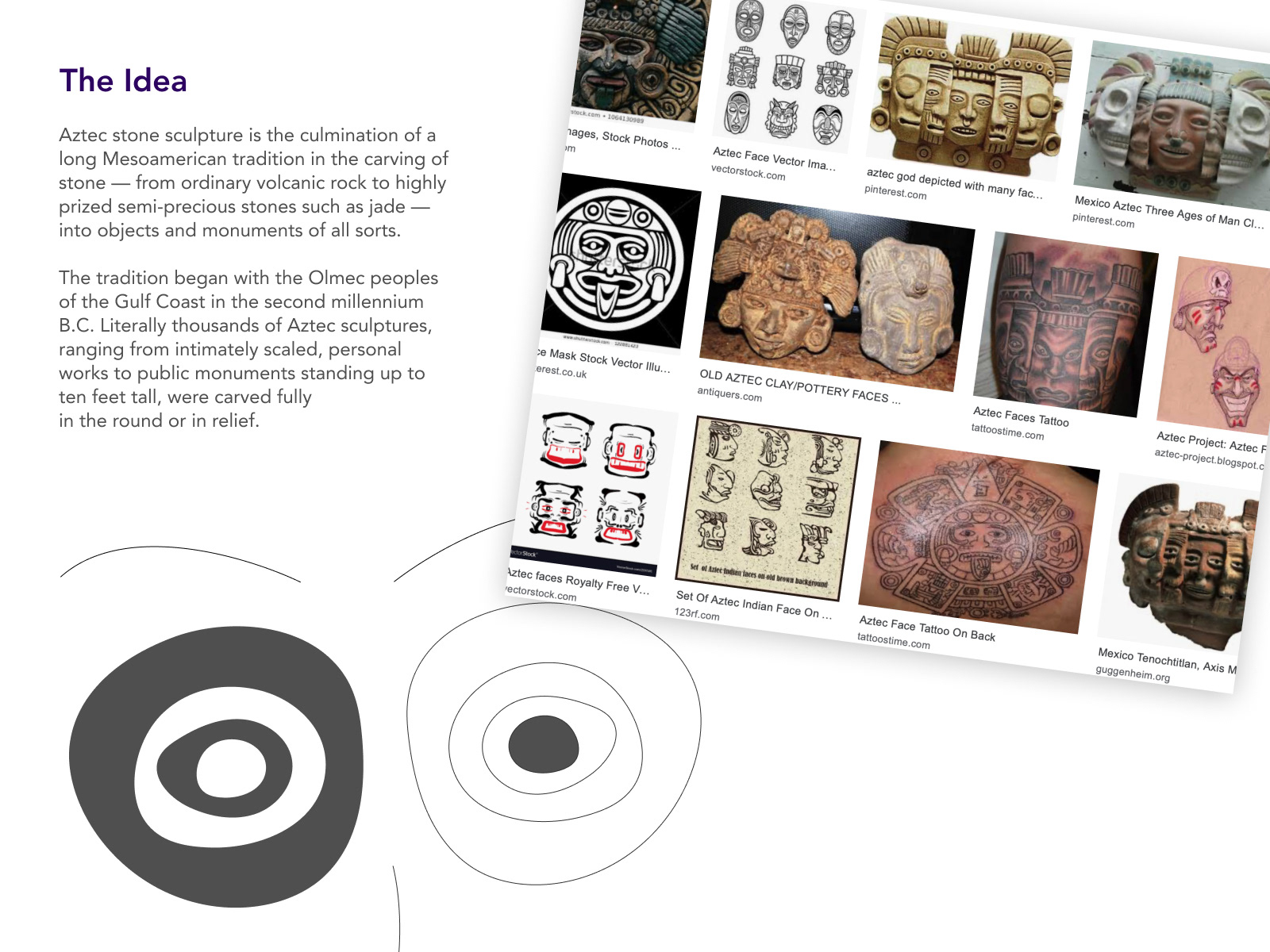
The Idea - Aztec Motives
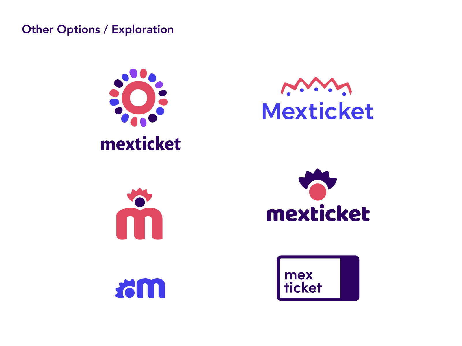
The main challenge in this project was to create a brand that stands out, but not because of some cliches. So we went over a few interviews, based on which the list f associations were created. Together we tried a lot of different symbols, trying to avoid very obvious ones like a sombrero, Mexican food, Carnaval costumes, etc.
During this project, we've had a few rounds of sketches and feedback sessions with the client. The final result was the best, as agreed. Unfortunately, the company did not implement the new branding yet, but it stays my most vibrant, bold, and (because of that) favorite branding so far.